
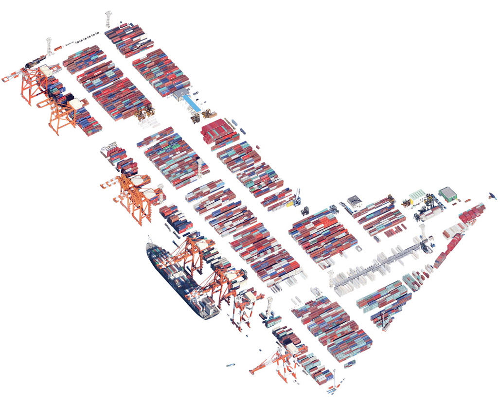
Data visualization for a 3-D model of San Francisco, by Skidmore, Owings & Merrill
Data visualization for a 3-D model of San Francisco, by Skidmore, Owings & Merrill
Map the holes, gaps and crevices in your life
Examine their emotional tone—dark, light, coloured
Walk into the void
Perforate your everyday navigational maps
Embrace chance encounters
Your local-social fabric is restitched
And, as you map anew, move toward interdependence
— Olafur Eliasson
Maps have always been essential. And contested. Today, they shape decisions both serious and trivial, from mapping gene activity, crime risks and rising housing prices to directing a pedestrian toward the most exotic cup of coffee or the most pleasant route to work. In our exhibition Urban Cartography, we examine that breadth with works that explore the spectrum from the enhanced navigational capabilities of good old-fashioned paper maps to the increasingly sophisticated capabilities of maps to help us visualize future scenarios, good and bad. The works here push the boundaries of what a map is for — and they offer a glimpse of even more possibilities to come.
Our relationship to maps has been completely transformed — as have the ways maps are made (and the people who can now make them). If once a map seemed only about getting one from A to B, now the new worlds made imaginable by contemporary cartography are ever-expanding. The maps on view during Urban Cartography (open through February 6, 2015) help us make sense of the seemingly mundane (highlighting bus route frequency, illustrating urban density) and the controversial (a map of private transit that shaped the discourse of a city, a map that exaggerates for effect, the impact of sea level rise).
Writer and historian Rebecca Solnit has written that a map is, “…in its essence and intent an arbitrary selection of information.” We’ll admit that definition also applies to the selection of works here on display: The aim is not to be exhaustive, historic — or even esoteric — but rather to present compelling examples of how contemporary cartography has transformed the way we experience our urban environment. One could call the collection assembled for Urban Cartography a variation on the theme of the city map, with a particular fascination with the iterative process of mapmaking: discovering what’s been eliminated, reduced, emphasized and/or removed. The exhibition also considers how maps of the city have become personal maps, dotted with events and experiences that explain, connect and even predict our choices. And we’ll admit to a Bay Area bias as so much incredible mapmaking is happening here.
“We think maps can be useful and fun, so we’ve designed Google Maps to simplify how to get from point A to point B.” – Google.com blog, February 2005
In the decades since the introduction of free online mapping services — MapQuest in 1996, and then Google Maps in 2005 —maps have reached a previously unimaginable point of ubiquity. We take the milestone of the appearance of these transformative technologies, together with the proliferation of the handheld supercomputers (aka smartphones) that support them, as our point of departure in this exhibition, not least for the ways the resulting data-driven design has given us dramatic new perceptions of the world(s) we inhabit. To be sure, more traditional methods of cartography remain and thrive. But at the same time, the new worlds made imaginable by contemporary cartography are ever-expanding.
Once primarily precise navigational tools, maps increasingly represent diverse and subjective realities. In the past, maps were more authoritative, the closely guarded documents that were the purview of kings, generals and heads of state. These people had power because they had the map.
Today, regular people with modest skills can make maps to represent the city that they live in. New forms of cartography allow people, in effect, to make themselves the center of their universe, creating a map specific to their desired and necessary uses. Even in what is perhaps the most common mapmaking scenario today, where Google owns the data and creates the product, each individual user is interacting with a different map. The level of variance and mutability is unprecedented.
But this dizzying diversity of sources, inputs and outputs is both an opportunity and a limitation. Having access to so many new perspectives necessitates having to make decisions about which of them to trust and include. Mapmakers (and map users) need to increasingly be aware of the biases that come with these challenges.
Prior to these relatively new digital tools, cartography seemed something of a dead language. Maps, for most, existed as static documents. Today, they are anything but. When it comes to the making of maps, speed has increased, costs have decreased and there are ever more robust tools available. Access to data has enhanced that functionality, and it has also opened the floodgates to an infinite array of possibility. Just as PageMaker resulted in a lot of lousy looking newsletters in the 1990s, the proliferation and accessibility of mapmaking tools has resulted in a lot of bad maps. More people know how to make maps today than ever before — which is amazing — but this broadening number of practitioners is driven in part by the increased commercialization of their output, which we would do well to pay attention to.
Urban cartography is in a period of rapid innovation. As exciting as that is, we should remember that maps need to be not just provocative but also credible. A high buzz factor exists about interactive maps in rarified circles but those outside that circle may wonder how durable this work really is. Does value recur? Any look at cartography today has to ask ‘Is this just eye candy?’ or ‘Will it make a difference?’ A map can’t just look good, it must resonate. Posing the wrong problem results in what one mapmaker calls “a beautiful mess.”
As critic and theorist Nicolas Bourriaud put it, “… modes of representation must be invented for a reality that is becoming more abstract each day.” True enough but there’s still room for the paper map in the contemporary world, the experience of which, explains transit planner Jay Primus, “is like reading a hardcover instead of a Kindle.”
Access to data has dramatically enhanced mapmaking functionality and has opened the floodgates to an infinite array of possibility. Open source toolkits are challenging the traditional role of GIS and GPS. Crowdsourcing aids in the mapping of everything from usage patterns in national parks to the destruction of the Amazon. With iPhones, drones or even just some helium and a balloon, one can now approximate Google’s aerial mapping. Civic groups like Code for America create mapping applications to help both government and citizens better understand what’s going on in their neighborhoods and how to change them for the better. Local groups like Maptime offers workshops to teach anyone who is interested how to make their own map. Nerds for Nature builds tools to help the public understand, protect and revive the natural world. Manylabs provides tools for learning math and science using sensors and simulations. Students in classrooms map their neighborhoods to better understand their communities. Others make personal maps simply to help make sense of their of own experiences.
This ubiquity does not automatically create literacy or awareness. For increasing numbers of people, the unwieldy paper map is an unknown or foreign object, an artifact akin to the rotary phone and cassette tape. This shift has affected the way we experience our environment and may be impacting our spatial awareness. As we increasingly rely on digital maps, we can find ourselves experiencing the real world through a screen. While it is too soon to determine what it means for us to be experiencing so much of our lives in a digital environment, it is worth considering what might be lost when our paths are so directed. Some have cautioned that a dependence on digital navigation systems like Google Street View will impede our ability to experience where we are — and that its increasing adoption might gradually erase aimless wandering. Nothing is left to chance. This limits what we see in the world in much the same way as our user-calibrated internet search tools funnel us to an increasingly narrow world of content. As maps good and bad proliferate, we would do well to reflect: What are the implications of only finding what we’re looking for and not discovering what we weren’t?
With “All the People on Google Earth,” artist Jenny Odell attempts to momentarily render humanity legible to itself by mining the surplus yet untapped value of secondhand imagery, mostly from Google Maps. “Changes in scale can unlock infinite possibilities in the very same subject matter,” explains Odell. “From the perspective of a satellite or a microscope, those elements of our environment which we took the most for granted suddenly appear fantastical, outlandish.” This change in perspective — as anyone who’s ever taken off in an airplane, or looked at something under a microscope, will have noticed — is the fastest way to re-experience something familiar. Without this shift, explains Odell, “We’re prone to ignoring the things around us that might actually be the most obviously interesting.”
In her Satellite Landscape series, Odell takes a virtual X-Acto knife to these aerial views, offering up new visions of infrastructure or bringing individuals who may have previously gone unnoticed to the foreground. Being able to toggle between different perspectives (from satellite view and street view on Google Maps, for example) allows us to see and understand more in each one, since we’re able to cross-reference what we perceive. This type of “salutary alienation” — in which you gain enough distance from your usual view of something that you not only register its existence, but you can better understand its place in a larger context — can be of political significance as well.
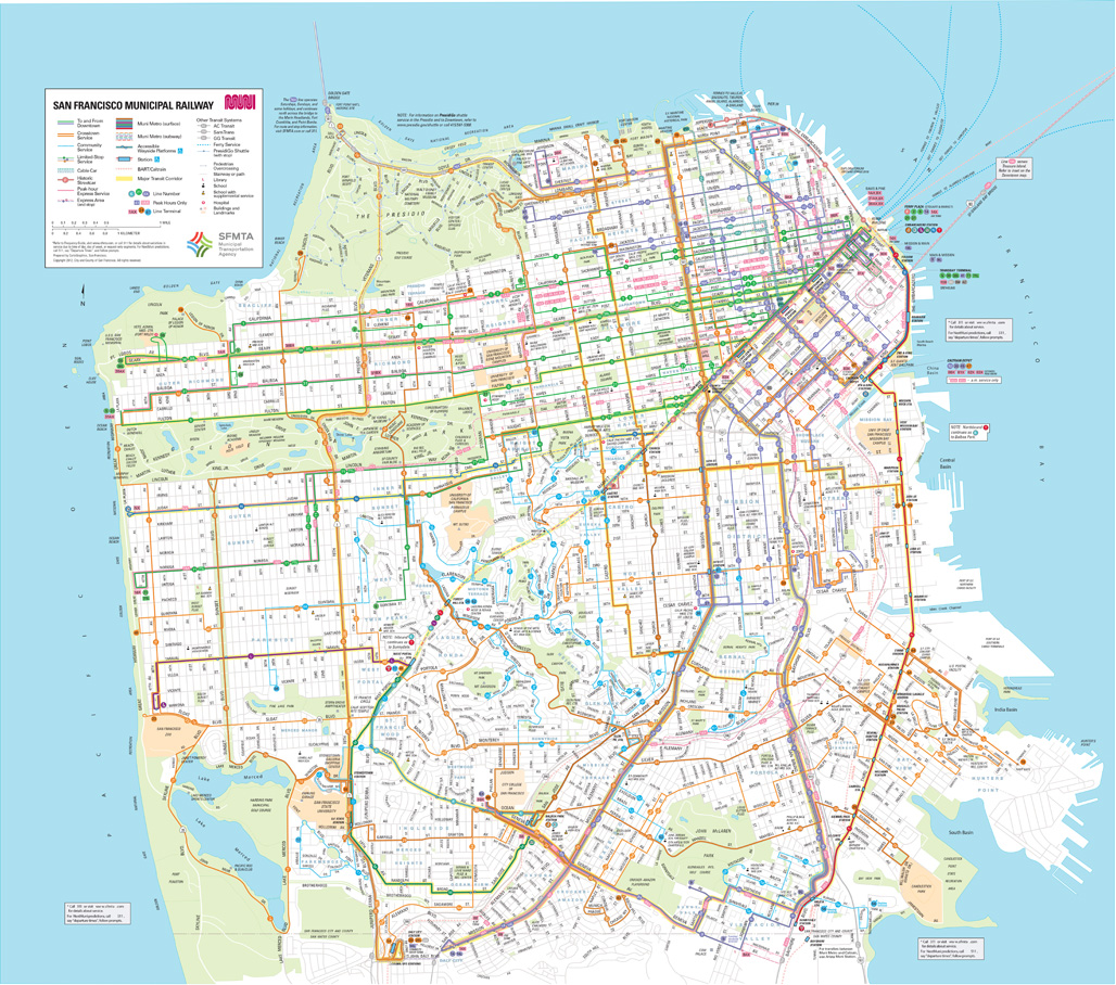
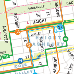
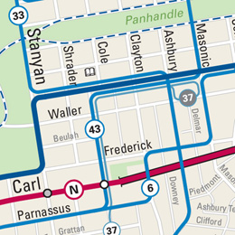
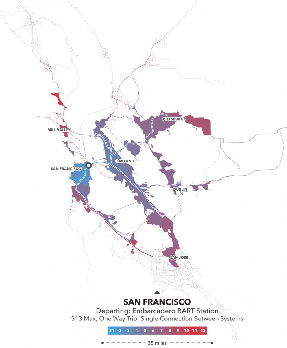
When transit planner Jay Primus and mapmaker David Wiggins decided to tackle a redesign of San Francisco’s public transportation map, they looked to simple design principles to guide the arduous evolution of an established and decadesold document. They combed through more than 300 maps from around the world for inspiration and ideas. When asked why they took on the task of redesigning the Muni map, Primus answers, “Dissatisfaction. It just needed to be better.”
An overriding goal was to say more with less. Primus explains that the map incorporates “a bit of Japanese design, a bit of Mark Twain. If anything can be removed, then you should remove it.” Yet because San Francisco has such a small footprint, it was possible to name every street — which would not be feasible for New York or London. “We could stay in the very literal realm,” says Primus. “That in and of itself is very useful. It let us enhance its utility as a pedestrian map.”
The map’s big move is to visually communicate one of the most important aspects of transit service for users: transit frequency. On the old map there was no telling if the 2 or the 38 was more important. Now, line thickness and color is used to indicate frequency. In this way, the new map communicates dramatically more information than the old one.
At its essence, this revised Muni map is a guide for leaving the house in the morning without a car. As for why it exists only in printed form, Primus explains, “You can communicate more information. Maps are so information-dense. It’s a matter of cost-effectiveness that we don’t have digital screens in every subway station and bus shelter. It’s more practical to put a printed one there. Plus there’s something about a fold-out map…we can give these away instead of forcing people to have smartphones. It’s like reading a hardcover rather than a Kindle.”
Muni will begin using the new map in 2015.
Old Muni Map
New Muni Map
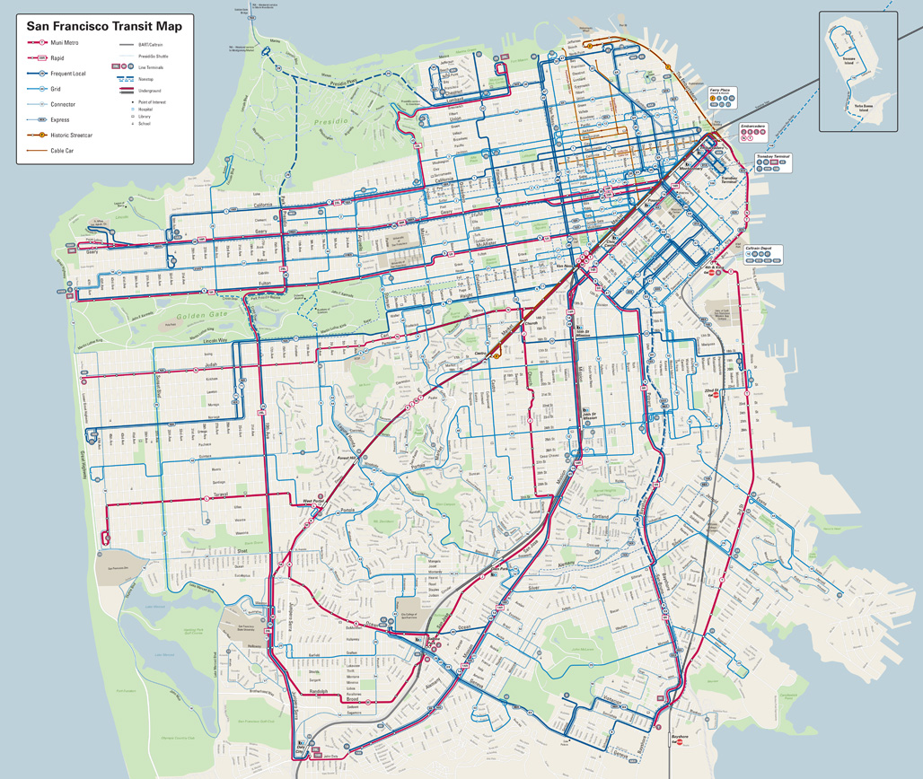
Old Map New Map
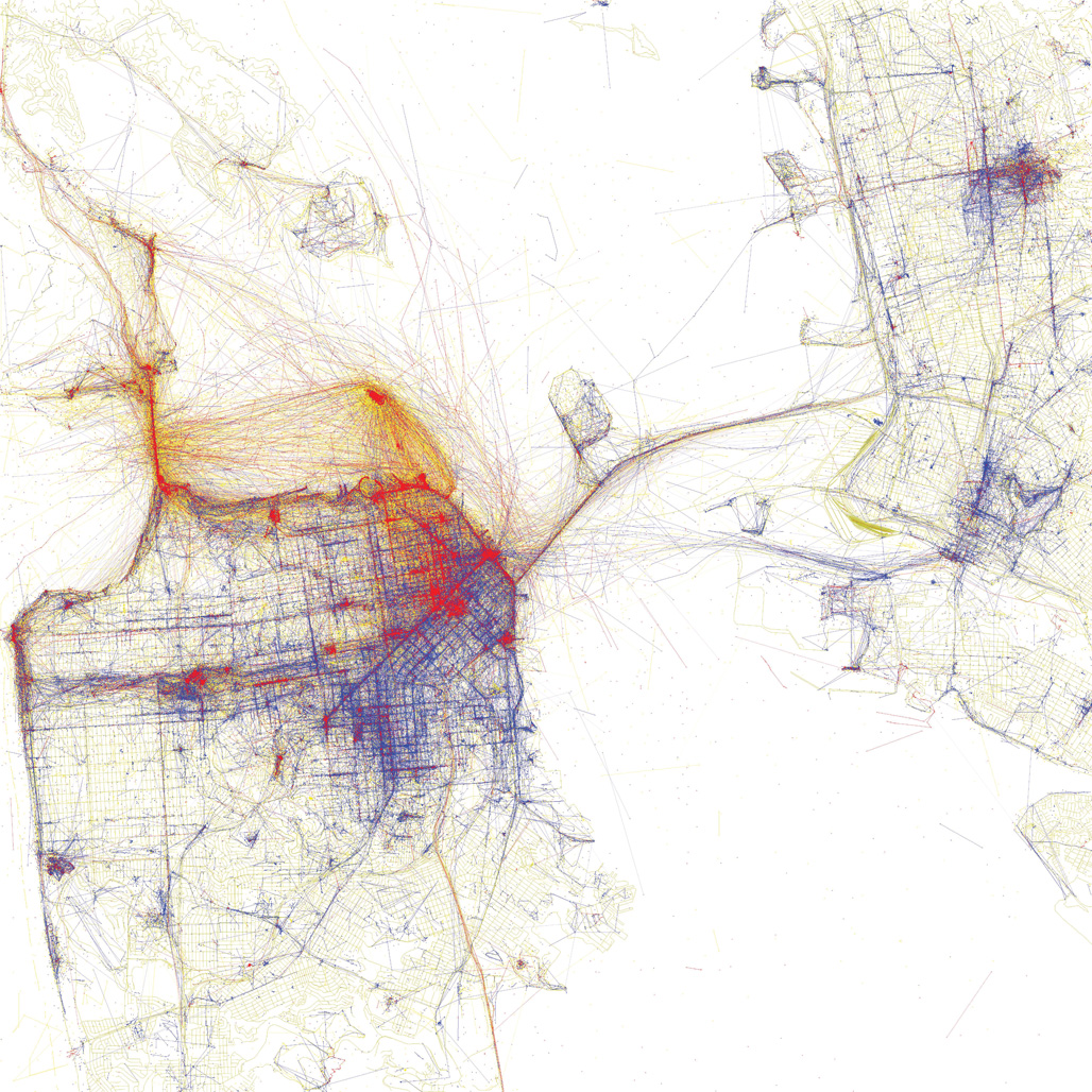
Eric Fischer has been on a quest: Learn what places in the world succeed in attracting people and understand why those places work. His series, “Geotaggers’ World Atlas” was the first major public result of an ongoing endeavor. “I had already been looking for a year at clusters of geotagged photos as signs of life,” explains Fischer, a cartographer at Mapbox. “But the new aspects of this iteration were the attempts to show links between places rather than treating each point in isolation and to guess transportation modes.”
There’s a highly engaged dialogue around contemporary cartography online. After posting his “Atlas,” Fischer received comments questioning whether the set of maps he’d created actually reflected the interests and activities of people living in cities, or whether it only showed tourist highlights. In most cities it turned out there were large areas that attracted lots of local attention but that tourists rarely visit, a discovery that led to “Tourists and Locals.” Fischer, who takes his inspiration from placemaking icons such as Jane Jacobs and William Whyte reflects that while he can’t hope to duplicate their detailed studies of particular sites, he’s instead trying to “cast my net as wide as possible to learn a little bit about a lot of places instead of everything about a few.”
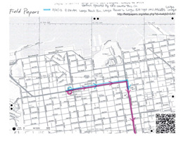
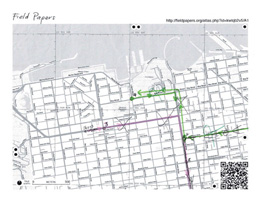
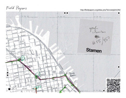
Stamen, a design and technology studio, tells stories about places with data. In 2012, the firm received a commission from the Zero1 Biennial to explore the relationship between San Francisco and Silicon Valley. “We decided we should look at employer shuttle buses,” explains founder Eric Rodenbeck. “We had no idea where they were going and figured we’d find out.” Usually Stamen’s projects pull data from web servers, but when they found this data didn’t exist, they decided to go out and gather it themselves. “These shuttles are hiding in plain sight,” Rodenbeck says. “They’ve become symbols of what’s changing in our urban landscape and hiding them seemed wrong. Here were these giant behemoths sliding through residential neighborhoods, and no one was allowed to know where they go.”
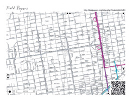
One morning, a crew from Stamen went to the corner of 18th and Dolores at 6:30 a.m. and counted the number of buses that went by and how many people got on them. As the project grew, they hired people on foot and on bikes to go to street corners and count buses. From this, they were able to develop a comprehensive map of the shuttle system (route studies are shown below).
Stamen didn’t make this map to show what’s wrong in San Francisco but simply as representation of what’s going on. “It’s not an anti-bus map,” Rodenbeck says. “We weren’t interested in taking a side. If Big Brother is watching where everyone goes, well, this is what it looks like. This map arrests your attention and gets you to think about things a little deeper. It’s amazing what kind of power this can have.”
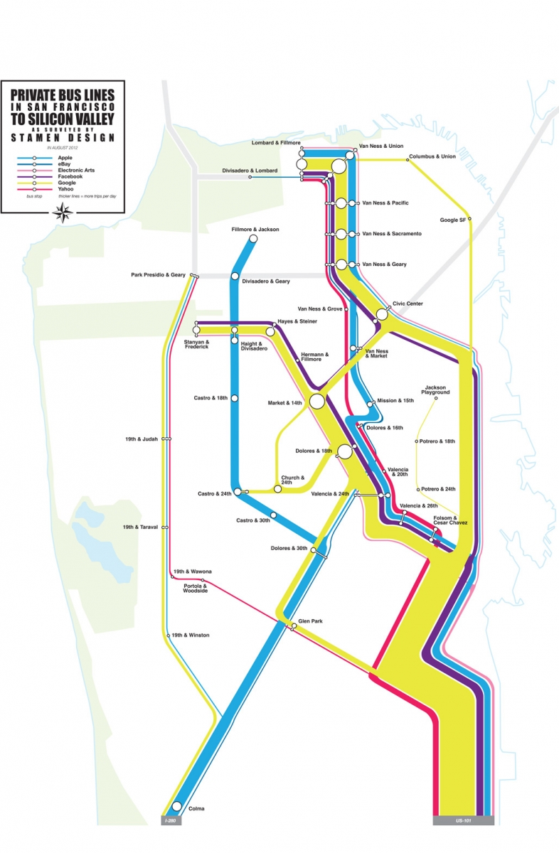
Route Studies
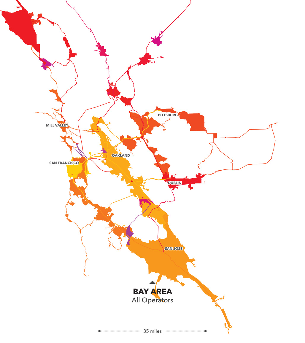
The Bay Area has 28 transit operators. Would the region be better served with fewer of them? How does this fragmentation of service affect the rider? How are costs and travel times impacted? These are some of the issues Andreas Viglakis set out to explore during a summer fellowship with Stamen Design and SPUR in 2014.
Viglakis began by experiencing the region’s vast transit system firsthand, traveling 160 miles over 13 hours on 8 different systems — in one very long day. “I realized that I had only a vague intuition about the actual size of each operator’s service area,” he says. “So I thought I would do a quick study that compared the Bay Area to a few other places that are more familiar to me. Despite having traveled much of its length when I first arrived, I was really surprised by how the Bay Area compares to New York, Washington, D.C., Los Angeles and London. At least as the crow flies, a San Francisco-San Jose commute is roughly comparable to one from the Hudson Valley to Brooklyn, or Baltimore to Arlington, Virginia.” It seems common to talk about the Bay Area as though it were a single place, akin to New York City or London, but these maps question this assumption and point, at least in terms of its physical area, to a regionally defined notion of the bay.
Among the questions this exploration posed is this: Is it reasonable to say that the Bay Area should operate as a single region? Viglakis acknowledges that transporting people from San Jose to the Embarcadero in an hour, or even in 90 minutes, may be unreasonable to ask of any transit network, but he also realizes that there are surely people riding these sorts of distances on public transit. “Transit Fragmentation in the Bay Area” suggests that the physical space of the regional economy places excessive demands on its people and infrastructure if it requires travel across such distances to live and work in the Bay Area. The operators in the Bay Area all have a different set of rules, and they are not playing well together. This study begins to hint at what might be possible if that changes.
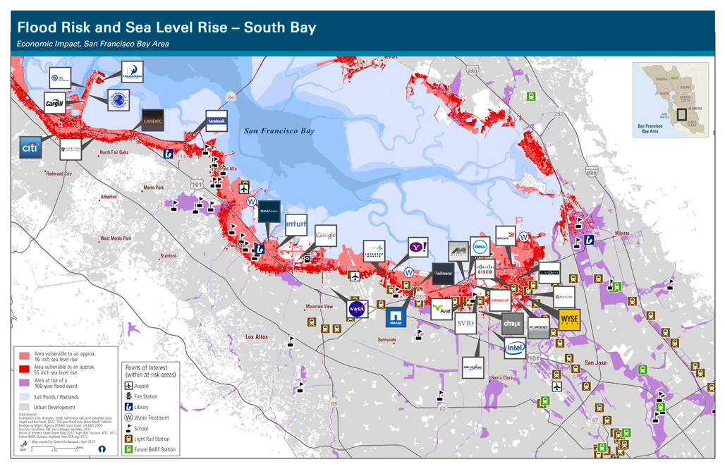
Making climate change visible is a formidable challenge. The prevailing imagery is often remote (such as melting ice floes) or aims to tug at our heartstrings (polar bear on melting ice floes) or is too abstract (charts). Global temperature maps typically do not move people to take action while many more creative attempts at visualizing future climate change impacts grab attention but are criticized for being too sensational or demotivating to inspire any real change in attitude or behavior.
But sometimes a little exaggeration is necessary. Green Info Network was asked by the Resources Legacy Fund to develop a map that would spark concern and engagement. Using modeled sea level rise data from the USGS paired with headquarters locations for major businesses in the South Bay area, Green Info’s maps (above) reveal that the biggest names in tech (Facebook, Google, et al) are facing climate change right out their back doors. Whether or not this impending threat is factoring into their respective expansion plans is as yet undetermined.
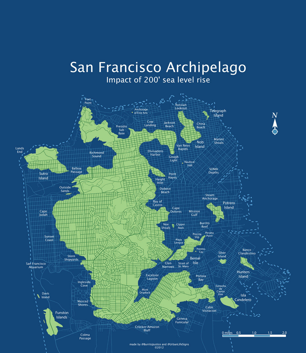
Cartographer Brian Stokle and San Francisco institution “Burrito Justice” would argue that even more exaggeration can go a long way. Stokle’s map of San Francisco shows what our coast would look like with a 25-foot storm surge or basic 25-foot sea level rise while his topographic map of the city shows how Yerba Buena Cove and Mission Bay might return to their watery origins. The pair’s joint effort, “The San Francisco Archipelago,” (at left) takes things to extremes (we hope), imagining the city that would result from 200 feet of sea level rise. Fifty years into the future, Burrito surmises, the canal system of the San Francisco archipelago is, of necessity, abandoned in favor of expanded ferry service.
Created by SOM, beginning in 2006, the San Francisco Digital Context Model represents the intersection of modern digital cartography and three-dimensional modeling of architectural and urban form.
The model begins with the same type of two dimensional GIS data that is the underpinning of mapping services like Google Maps, but through a carefully designed and controlled process, turns it into a consistent and easily editable three-dimensional representation of the city’s built form. The model covers the entire city at varying levels of detail and accuracy, and detail and accuracy are tracked separately for each building object, enabling organic improvement of the model over time and confidence in the results of important analyses. Buildings are tagged with parcel and block information using city standard formats, allowing custom scripted tools to correlate the building form, location and underlying ground plane to external databases like census or other demographic data. This inclusion of a small amount of data in the model allows a significant amount of information to be correlated from external sources.
A series of custom algorithms is used to analyze the requirements of San Francisco’s planning codes as well as economic factors like the value of views, daylight or proximity to amenities and infrastructure. The model also allows the rapid study and visualization of the impact of a building on public view corridors, aesthetics at the urban scale and the impact of a building on environmental comfort including light, shadow, and wind. Accordingly, the model has been instrumental in synthesizing the complex set of physical, legislative, and economic constraints that drive the design decisions made in large-scale urban projects.
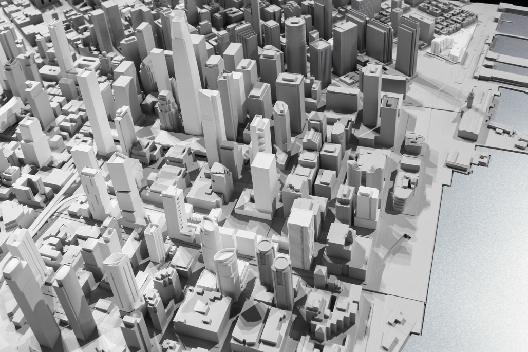 Photo by Noah Christman
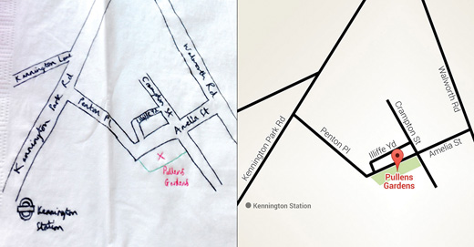
Digital maps have reached such an unimaginable point of ubiquity that it’s hard to believe it’s been just under a decade since the launch of Google Maps. These maps demonstrate the iterative process of the Google Maps team — including early explorations that began with the napkin sketch. “It’s an abstracted map that shows the most important information and omits some of the less important so you can focus on the stuff you care about,” explains Google Maps’ Lead DesignerJonah Jones.
Digital maps are quite a different medium than printed ones, which have to be comprehensive. You can’t zoom in, you can’t add or remove layers. You’ve got to show everything. A digital map has to be designed to be a quick read. You have to look at it for a few seconds and not be overwhelmed. So at the outset, Google had to grapple with what to show — and at the beginning, it was mostly roads.
But as these maps from 2009 and 2014 show, much has changed over the years. The old map was heavily focused on roads and highways. The typography was very homogenous. It was difficult to tell the difference between a park and a neighborhood. But in the most recent version, explains Jones, “You see a more balanced map. There’s a greater diversity in typography. Transit is shown, as are major landmarks. Lots of small changes. With the amount of data we have now, we can begin to think deeply about what we leave out as the interesting part. Our job is now to determine what gets included and what isn’t.”
Google Map of the Bay Area, 2009
Google Map of the Bay Area, 2014
The napkin sketch and an early iteration of the map.