Great design can transform and enhance any user experience. Why, then, is thoughtful design often ignored within our transit systems? Unified color schemes, streamlined maps and proper way-finding systems aren’t just window-dressing — when done well, they’re essentials tools for creating friendlier and more accessible networks. Design and system usability go hand-in-hand, and thoughtful design tactics can bring cohesion that allows potential users to make sense of the transportation options available to them. With those principles in mind, SPUR recently held a day of workshops and presentations, sponsored by TransitCenter, to explore the future of design and public transportation.
Contributors championed the benefits that excellent visual design can have on the effectiveness of transit and shed some light on plans to prioritize quality transportation design here in the Bay Area. BART planner Tim Chan outlined plans to improve way finding and station design, focusing mainly on upcoming projects at 19th Street and Powell.
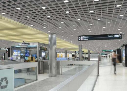
A rendering of BART’s plans to update stations design at Powell Street. Courtesy BART.
Aside from boosting comfort and civic pride, Chan noted that simple design tweaks can help enhance overall system functionality and user approval at relatively minimal cost. Just as adding mirrors to an elevator quells a rider’s claustrophobia, adding art or retail to a subway stop makes commuting more enjoyable.
Beth Schechter of Stamen Design, a firm best known for mapping tech shuttle routes to and from San Francisco, presented examples from her firm's highly successful maps for the London Organizing Committee of the Olympic Games.
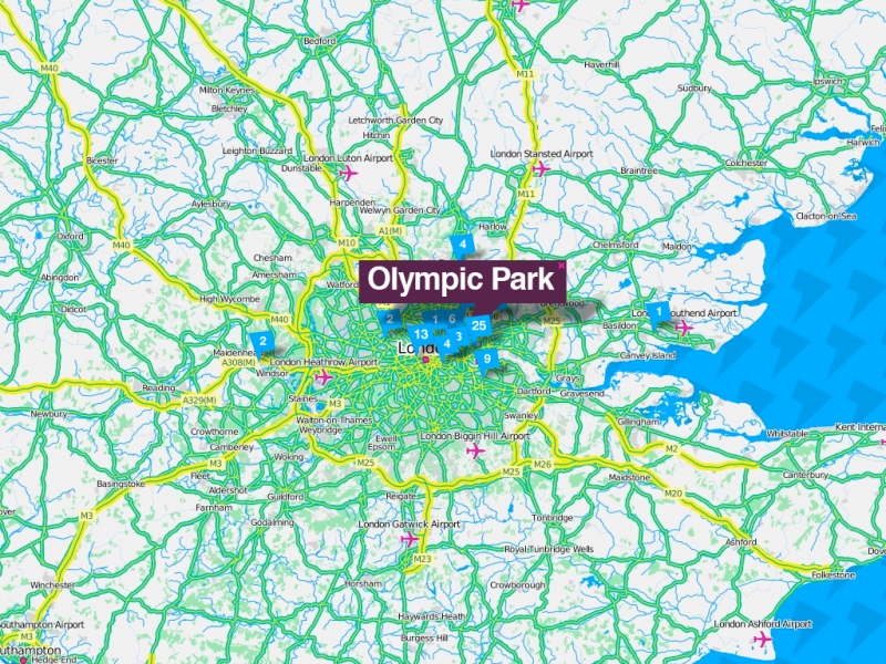
Enlarge map >>
One of Stamen’s maps for the London Olympics. Courtesy Stamen Design.
Transport for London has applied its iconic bar-and-circle logo across every mode in the system. This unified brand identity gives riders across the region a trustworthy and recognizable icon to look for as they travel through the city. Along those lines, presenter Danielle Dai pointed out how Lance Wyman’s geographic icons from Mexico City’s subway map play a key role in system usability. A set of drawn landmarks, each representing a station, give tourists or those with limited knowledge of Spanish the ability to get around the city quickly and easily.
![]()
Lance Wyman’s icons for the Mexico City metro. Image courtesy Lance Wyman
SPUR’s recent Seamless Transit report outlines opportunities to grow rider confidence in using transit through design. In the Bay Area, a region served by more than two-dozen different agencies, the abundance of logos and map designs can turn off even savvy transit users. Even without changes to the structures that govern our various agencies, cohesive information systems, route maps and design could go a long way toward making straphangers feel more comfortable jumping between different systems and modes of transportation.
Though we in the Bay Area have a long way to go to achieve design unity and its resulting increase in usability, individual jurisdictions are starting to use design to create more comprehensible networks. For instance, the SFMTA’s new Muni map, rethought by Jay Primus and David Wiggins, reduces clutter and places visual emphasis on the system’s most frequent and reliable lines. Simple design tweaks — in this case changes to a map’s color scheme, fonts and line thickness — can transform the way users perceive, and use, the network.
Great design applied to information technology can also revolutionize transit systems. Sam Hashemi, Co-founder & CEO at Transitmix, explained how tech tools that rely heavily on clear visuals are now able to answer complex network-level questions pertaining to issues such as service gaps and investment-to-population density ratios. Spring Studio helped workshop participants learn about a set of structured tools such as customer journey maps, to understand use pain points and find opportunities to problem solve.
Design is thus key when considering transit’s effectiveness. With more attention and funding given to projects that focus on system unity, information campaigns and user-friendliness, the Bay Area’s transit network can become more effective, efficient and enjoyable.