With just under a year in operation, San Francisco's "data liberation" website, DataSF, has inspired some compelling visualizations. One person who has actively taken advantage of this website is flickr user Eric Fischer. This past week he introduced an animated graphic that caught my eye.
While it may take a few views to deduce, this animation shows a full day, starting and ending at 3 a.m., with each of the days layered on top of each other. Wanting to know even more about the process, I figured I would reach out to him to get his thoughts. In an email conversation with Fischer, he revealed that he wrote a program to filter the DataSF files by both minute and hour, and then plotted each of the points. He then converted the set of images into a movie file.
According to Fischer, "there is actually no base map that it is overlaid onto -- where streets are visible in the animation, they are visible just because Muni vehicles have passed along them." To him the results speak to the relative regularity of service. A route like the 108 Treasure Island, if viewed in isolation, seems to confirm his assessment.
I was also intrigued as to what other type of data Fischer wished he had access to, and what would inspire more creative output. According to Fischer, "as great as real-time data is, I wish sources of it like NextBus would also make records of the past available, since often it is more interesting to find out what has changed over time than what is happening right now."
If you enjoyed his animation, explore some of Eric Fischer's other work on flickr.
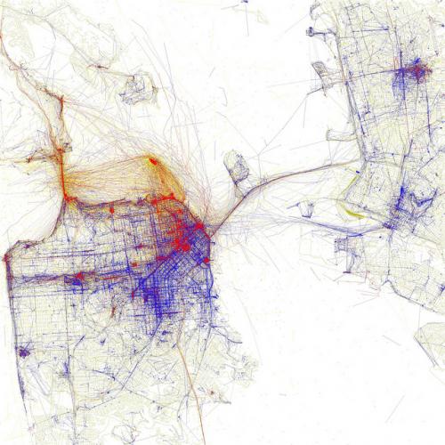
"Locals vs. tourists" [Photo Credit: Eric Fischer]
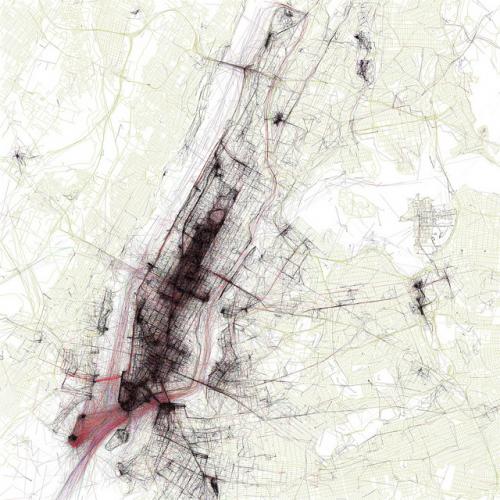
"Geotaggers' world atlas" [Photo Credit: Eric Fischer]