Data. The mere mention of the word can overwhelm, baffle, and cause general disorientation. In its raw state, or as displayed in traditional forms such as pie charts and bar graphs, data has a tendency to elicit these negative reactions. This confusion occurs when the reader is unable to decipher what story is being told, or why they are being told it. Given appropriate visual context and intuitive design, data has the power to modify behavior and influence the way we confront societal problems.
SPUR's latest series will analyze visual representations of data reflecting patterns in urban life, ranging from infographics to animation, powerpoints to histograms. Not all will be good, as we also can learn from clumsy design and ambiguous data. All the graphics, however, will question why we live the way we do and explore the underlying forces on our behavior.
Earlier this week, the DC-based Brookings Institute released a "State of the Metropolitan America: On the front lines of demographic transformation." This extensive report details "the continued growth and outward expansion of our population, its ongoing racial and ethnic diversification, the rapid aging on the horizon, our increasing but selective higher educational attainment, and the intensified income polarization experienced by our workers and families." To go along with the nearly 170-page document, Brookings provided this data-intensive graphic:
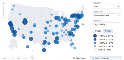
This graphic allows tremendous user interactivity. The user selects from a criteria of demographics, time frames, locations, and other indicators.
Stand-Out Facts:
City with the greatest percent of population between 15-24 years old:
Provo, UT Metro Area (40%)
City with the greatest percent of population 65 and up:
Sarasota, FL Metro Area (26.8%)
Percent of SF Metro Area workers who commute by public transportation:
14.4 % (2nd in the nation)
City with greatest percent of workers who commute by driving alone:
Youngstown, OH Metro Area (85%)